ZeeMee Design Exercise
A self-directed exercise for ZeeMee's hiring panel. I audited the college-admissions app end to end, then rebuilt the moments that matter most as a working, mobile-first app you can click through.
View the Demo
My role
I ran the whole exercise solo over a few-day sprint, owning the audit, the UX, the UI, and the front end. I built it the way I work now, prototyping in code with Claude as a pair and shipping every screen as a real Next.js, React, and Tailwind v4 component instead of a Figma comp.
Services


The problem
ZeeMee helps students find their people before they arrive on campus, but the app it ships hides that warmth. Auditing 72 screens across 12 workflows turned up four visual eras sharing one app, a tab bar and CTA color fighting the brand, and empty states doing no work. The moments that should feel biggest, getting admitted, making a first friend, finishing a profile, all carried the visual restraint of a B2B SaaS tool. For a 17-year-old deciding in the first minute whether an app is for them, flat reads as not-for-me.
Solution
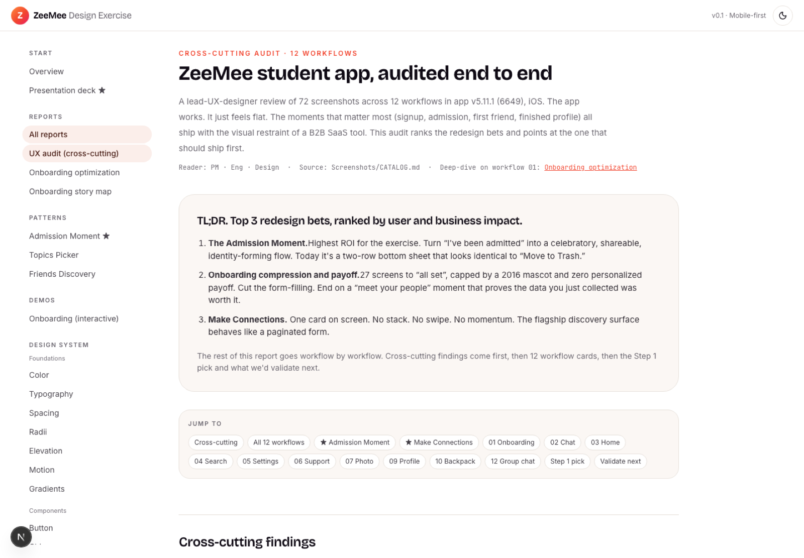
ux audit
The exercise opens with a cross-cutting audit of 72 screens across 12 workflows. It names what's wrong, four visual eras, a too-quiet tab bar, empty states doing no work, a CTA color fighting the brand, then ranks the redesign bets by user and business impact and lands on the Admission Moment as the one to ship first.
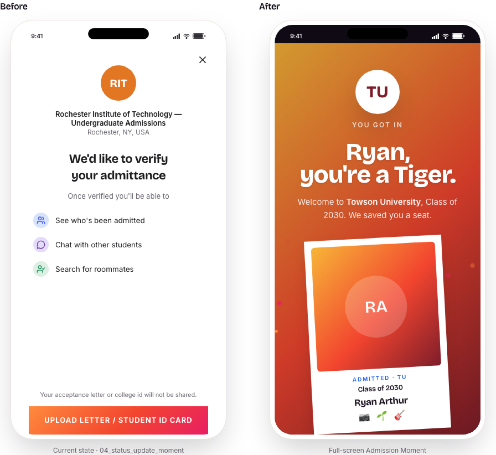
admission moment
Getting admitted is the highest-emotion moment in the journey, and today it's a verification modal that looks like "Move to Trash." The redesign replaces it with a full-screen, school-colored takeover and a shareable card sized for a story, then hands the student straight into the admitted-students chat. That's free distribution at the highest-affinity moment in the funnel.
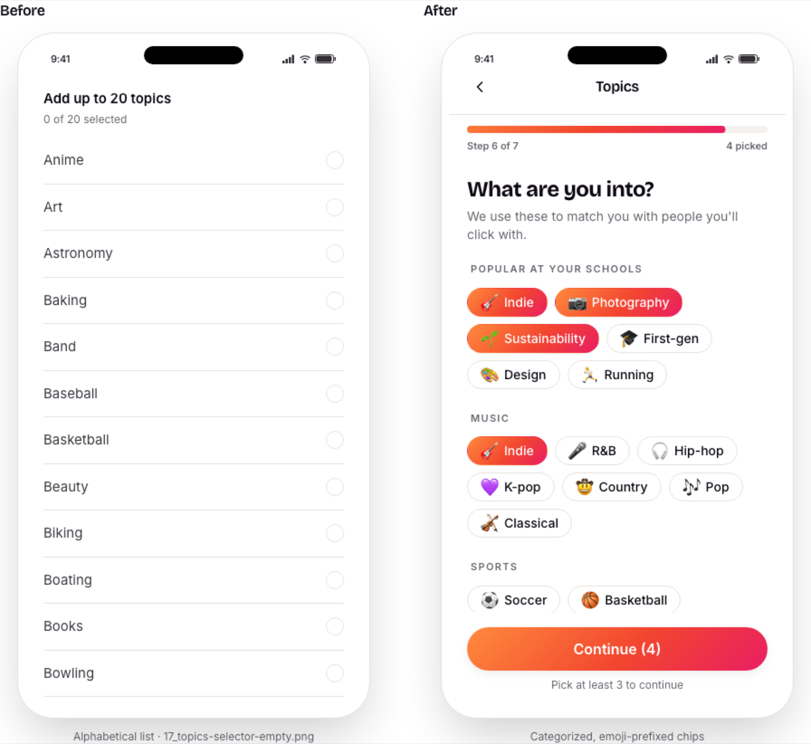
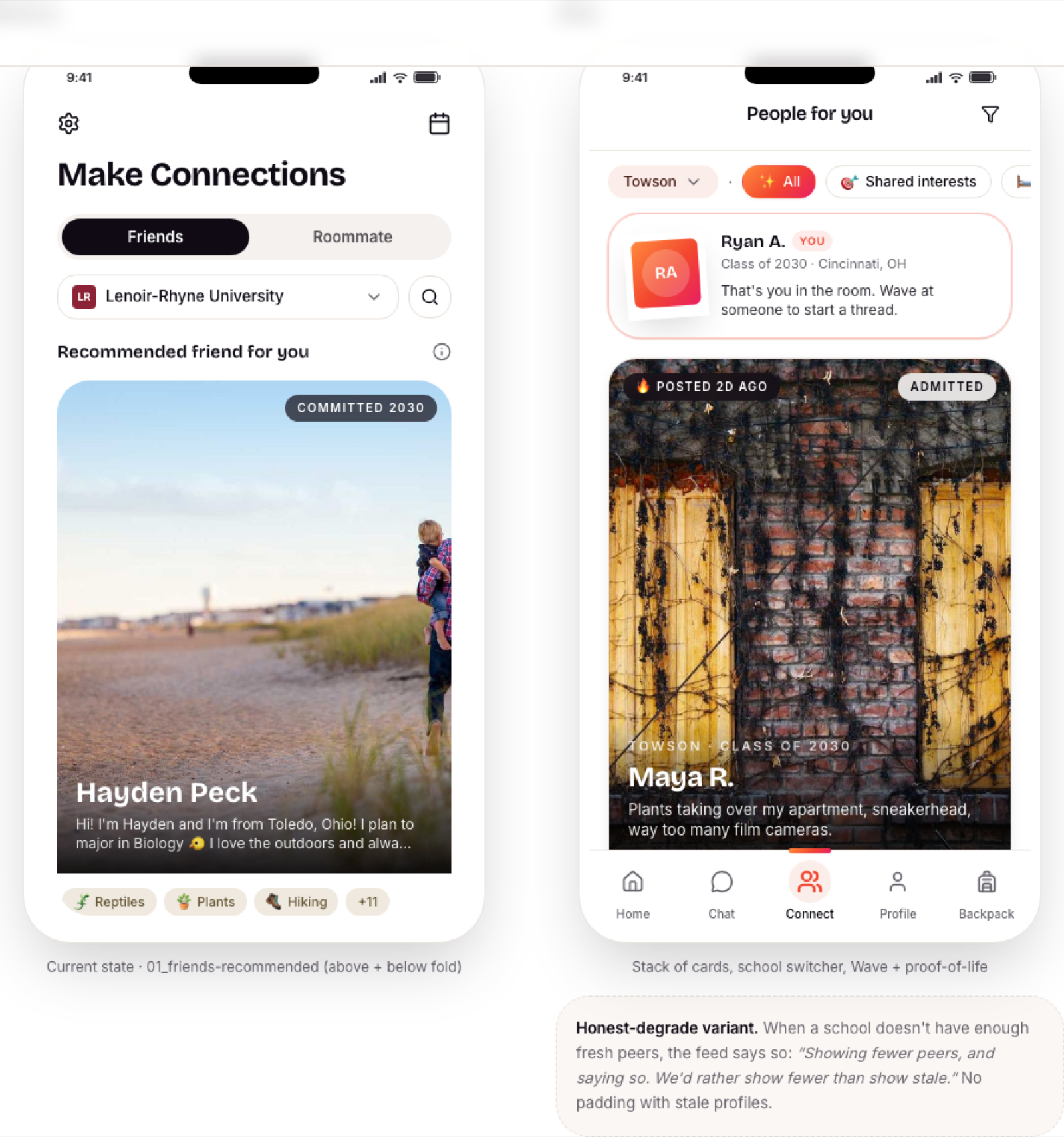
topics picker
The audit called the legacy Topics screen the most under-designed surface in the app: an alphabetical list of 100+ items that the entire matching engine runs on. I rebuilt it as a categorized grid of emoji chips, led by what's popular at the student's own schools, so the screen that powers matching is one students actually want to tap.
friends discovery
Make Connections shipped one card at a time, no stack and no momentum, closer to a paginated form than a discovery feed. The rebuild gives it a swipeable stack, a school switcher, shared-topic context, and a one-tap Wave, so finding your people feels like the point instead of a chore.
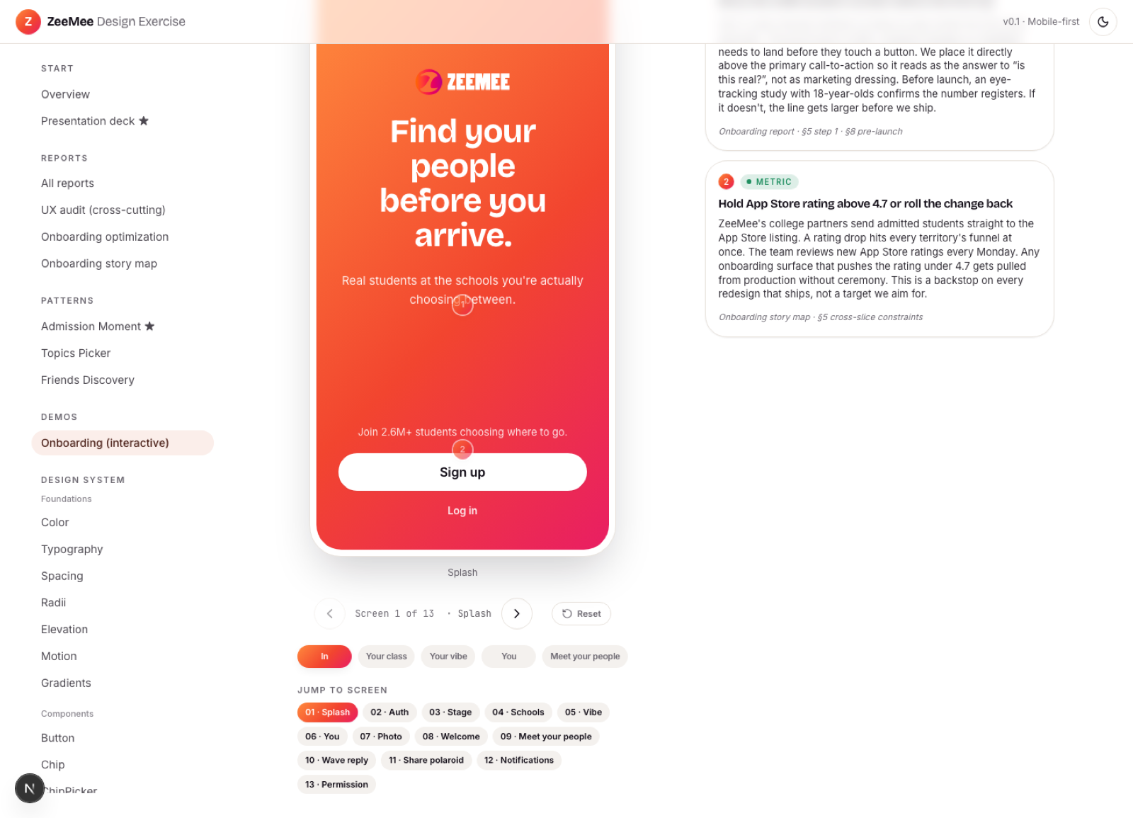
onboarding demo
The redesigned first-run flow, clickable end to end, following one student from splash to her first Wave reply. Numbered pins on every screen surface the tradeoffs, risks, validation gates, and metrics behind each decision, so the demo makes its own argument.
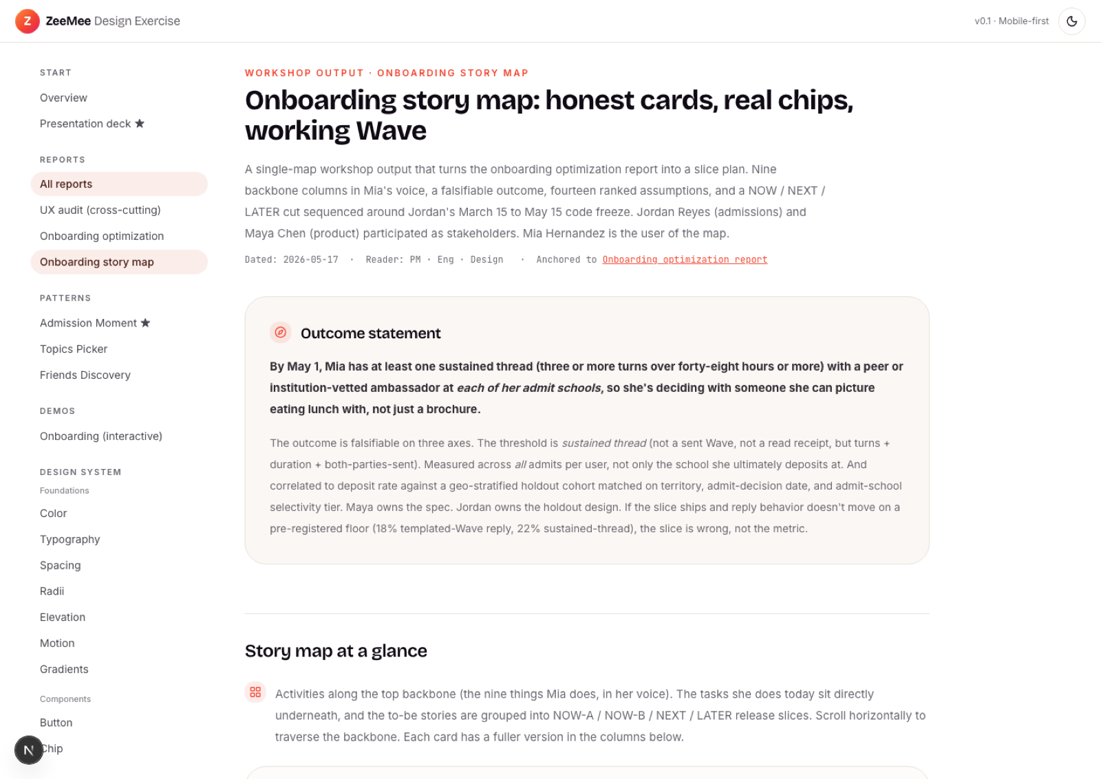
story map
A story map turns the onboarding report into a plan you can ship: nine backbone columns in the student's voice, a falsifiable outcome to hit by May 1, and fourteen ranked assumptions sliced into NOW, NEXT, and LATER around a real code freeze. It's the bridge from audit to roadmap.
design system
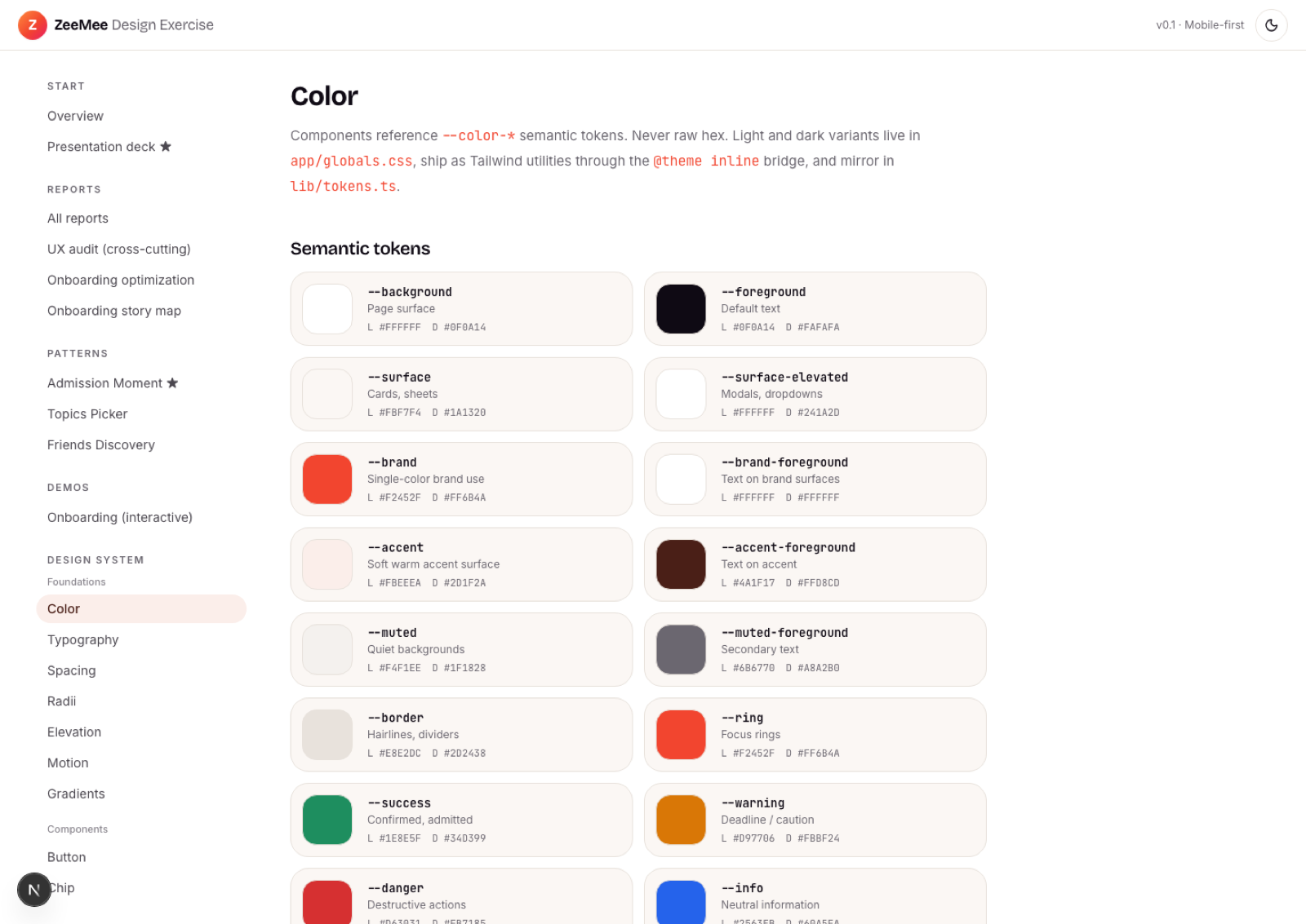
Underneath all of it sits a token-driven design system, built in code. Semantic color, type, spacing, elevation, motion, and radii tokens drive every component, so the deep-blue legacy button, the yellow chip, and the orange-text CTA the audit flagged collapse into one brand language. Every primitive is sized for a 44pt tap target and previewed in a phone frame.
Outcome
The exercise shipped as one clickable app: a cross-cutting audit, three rebuilt hero patterns, an interactive onboarding flow, a story map, an 18-slide deck, and a token-driven design system, all at mobile width. It stands as proof of how I work, taking an ambiguous brief from discovery to a running front end in days.
View the Demo
About the client
ZeeMee is the social app where future college students meet their classmates, find roommates, and join their campus community before day one.

