Matador Logo
A logo for a fictional athletic gear company that embodies the essence of pushing performance limits with sleek, high-quality products, encapsulated in the ethos: Stand strong. Be bold. Command attention.
See case study
My role
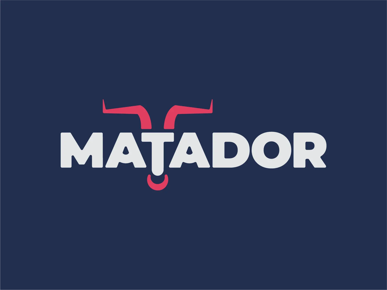
I designed the logo and wordmark, building the stylized bull horns and nose ring into the lettering and setting the navy, red, and white palette.
Services
The problem
Matador is a fictional athletic gear company built on a single ethos, stand strong, be bold, command attention. It needed a mark that read as high-performance without leaning on the visual cliches of the category.
Solution
Matador Athletic Apparel Logo
The art style, minimalist, geometric, and modern, communicates strength through simplicity. The stylized bull horns and nose ring embedded in the wordmark are subtle yet iconic, emphasizing that Matador is about more than just performance; it’s about making an impact. Deep navy blue symbolizes trust, authority, and professionalism, anchoring the brand in dependability. Vibrant red reflects passion, energy, and boldness—the daring spirit of a challenger unafraid of risks. Crisp white provides balance, representing clarity, honesty, and transparency.
Outcome
The result is a minimalist, geometric mark with the bull horns and nose ring worked into the wordmark, carried by a navy, red, and white palette.
About the client
Matador was conceived with a simple idea: that in a world overflowing with noise, only bold moves create lasting impact.
