Ground Control Station
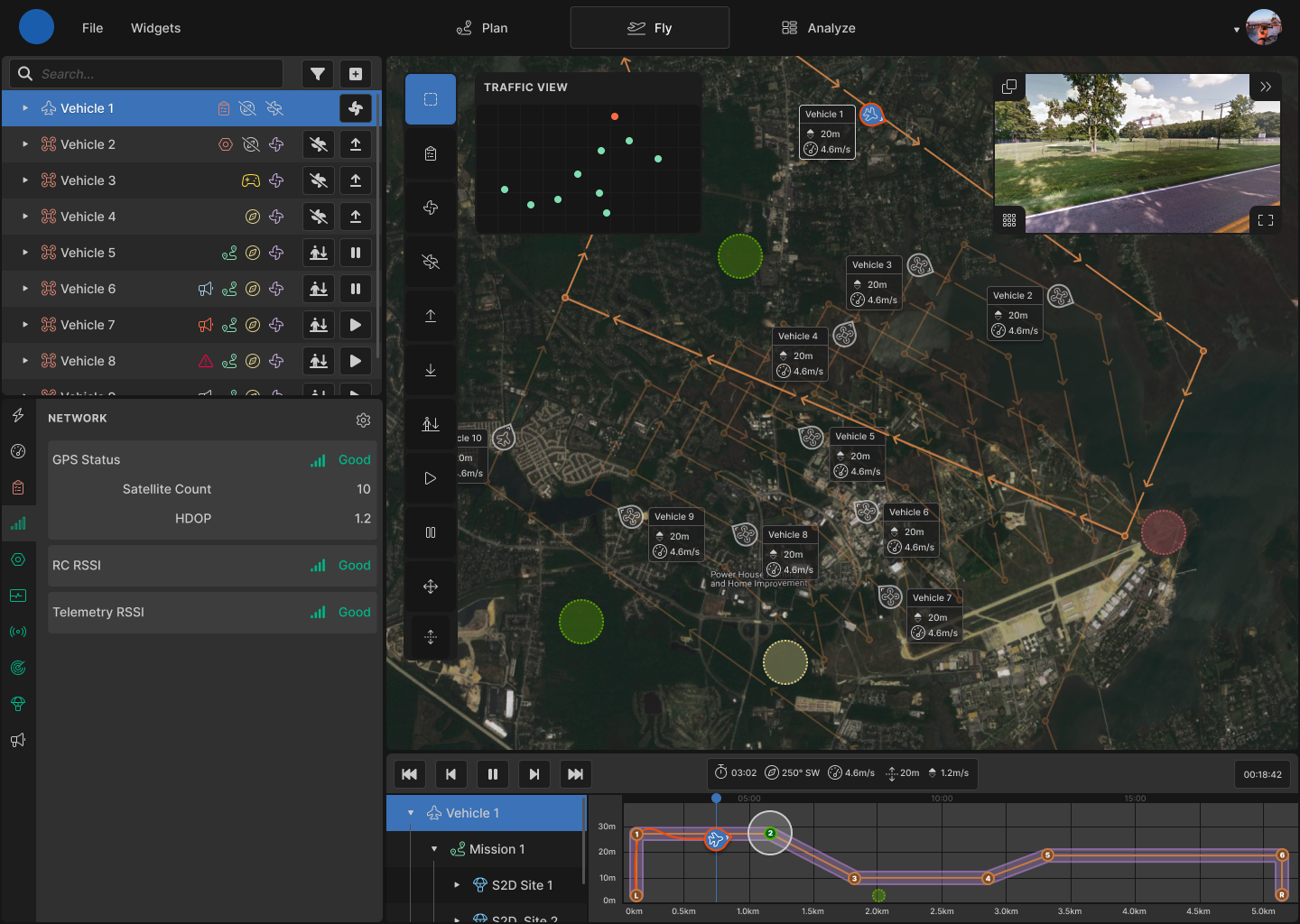
The goal of this NASA sponsored challenge was to design an effective interface for simultaneously managing multiple autonomous vehicles.
See case study
Services

NASA is researching future aviation operations where pilots will simultaneously control multiple aircraft remotely
Solution
fly mode
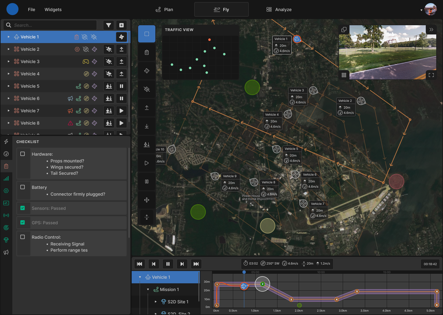
The UI is divided into several flexible tiled windows to enhance the user's focus. All the windows are interconnected but are specialized to show specific vehicle information. Together they provide a complete picture of how the vehicles are operating.
vehicle status
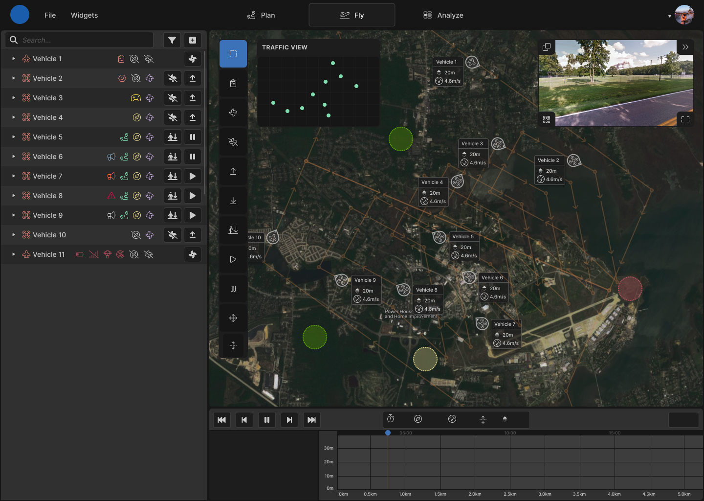
Imagining how to display all of the relevant information about not just one but multiple vehicles in a way the user could quickly understand was the most challenging task of the competition. I used a series of icons, as well as colors, to represent the various states that a vehicle can have. The outliner also contains controls for affecting each vehicle's basic flight operations.
instruments
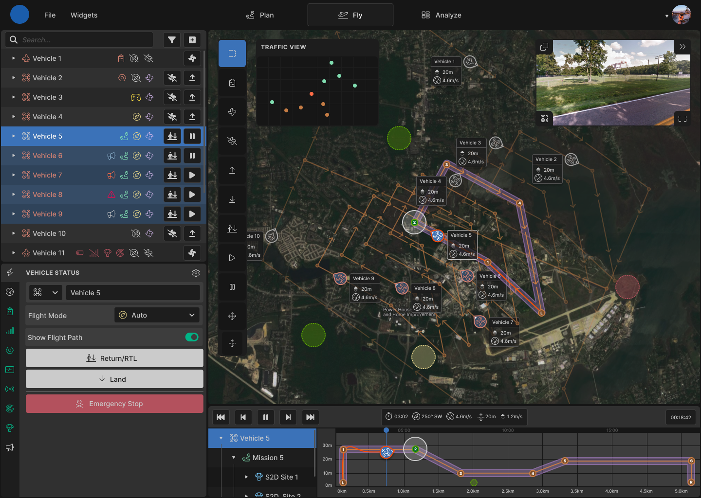
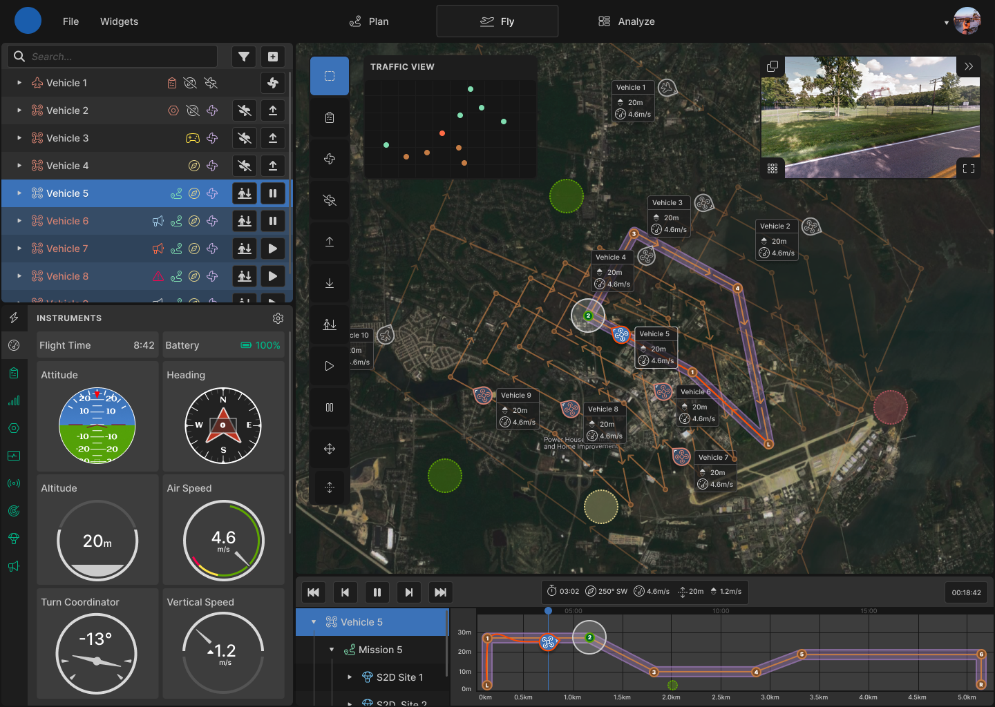
The details panel condenses a wealth of vehicle information into an easy-to-navigate window. Users can quickly see focused vehicle information and controls by switching between the tabbed interface. Each tab icon also corresponds to an alert icon in the outliner.
checklist
The mission timeline displays a representation of a vehicle's progress through a planned mission. It also serves a dual purpose of graphically showing the vehicle altitude that can't be seen on the top-down map. The user can scrub through the timeline to see recorded or estimated spacial information to plan or review a mission.
network
The map shows where the vehicles are in space. Several other components are overlayed on top of the map view. The toolbar along the left edge of the map contains all the tools for selecting and affecting vehicle operation. The traffic view window serves as a minimap with a simplified high-contrast view of vehicle positions. The camera window displays a stream from the selected vehicle's camera.
