Tech Agency Brand Guide
This project presents a brand concept for Launch Scout, a tech agency focused on custom software solutions. The core of the brand identity is a logo that blends a spaceship and an eye. Although it wasn't ultimately selected, it was a strong contender for the final design.
See case study
Services

Your launch pad for custom software ideation, design, and development.
Solution
Logo
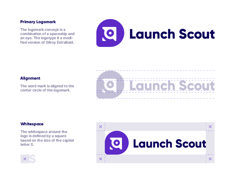
The logo concept for Launch Scout is a visual distillation of the company's name and mission. The logomark, a combination of a spaceship and an eye, is a deliberate choice. The spaceship represents the "launching" of innovative new ideas and custom software solutions, while the eye symbolizes the "scouting" for problems and opportunities within the tech landscape. This dual-meaning mark creates a memorable and distinctive brand asset. The accompanying logotype, a modified version of Gilroy ExtraBold, was selected for its clean, geometric forms that project a sense of modernity and stability.

Alignment
I meticulously defined the alignment and whitespace to ensure the logo maintains its integrity and impact across all applications. The inclusion of horizontal, vertical, and knockout variations demonstrates a forward-thinking approach, ensuring the brand is versatile and adaptable to any platform or medium.
Layout Variations
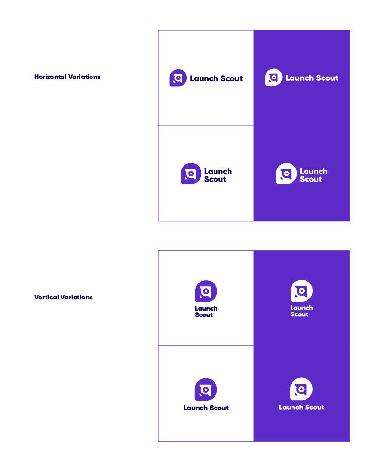
I developed a series of horizontal and vertical logo layouts to ensure that the Launch Scout brand can be effectively represented in any space, whether it's the narrow masthead of a website, the circular profile icon on social media, or a tall banner ad. This isn't just a matter of aesthetics; it's a strategic decision that guarantees the brand's visibility and impact across all platforms, from digital to print.
Color Palette
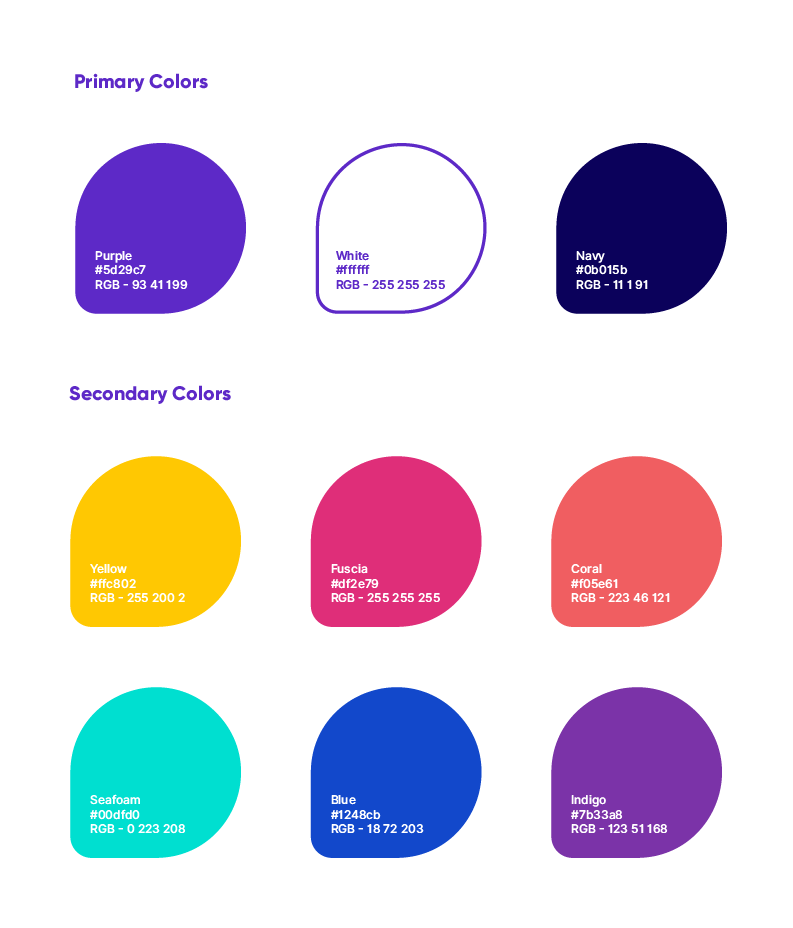
The color palette was strategically chosen to reinforce Launch Scout's brand identity. We anchored the palette with a deep purple and navy, which are associated with innovation, authority, and professionalism. These core colors establish a foundation of trust and expertise, crucial for a tech agency. To inject a sense of dynamism and creativity, we introduced a secondary palette of vibrant hues like yellow, fuchsia, and coral. These colors are used as accents to highlight key information and create visual interest without compromising the brand's professional tone.
Color Combinations
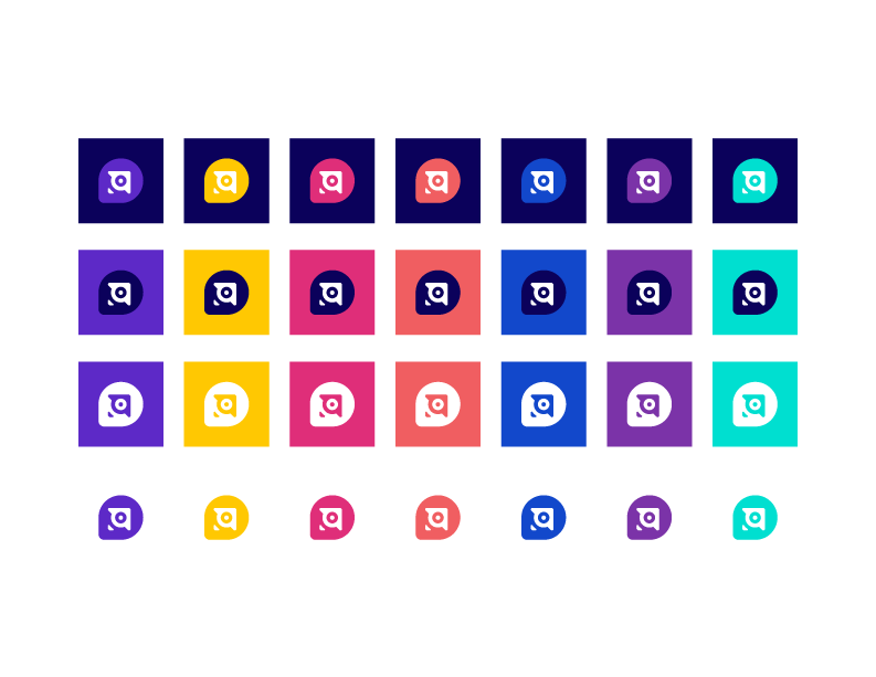
The palette is designed to be a strategic balance of opposing forces. The use of deep primary colors like purple and navy establishes a credible and professional foundation, essential for a trustworthy tech agency. This serious tone is then complemented by the introduction of vibrant secondary accents, such as yellow, fuchsia, and coral. This combination creates a sophisticated and approachable brand, demonstrating that Launch Scout is both an authoritative leader and a creative, dynamic partner in the custom software space.
Typography
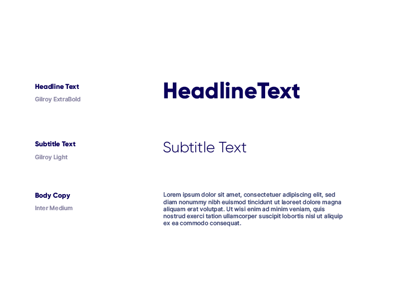
The typographic system was designed to create a clear visual hierarchy and project a confident, modern tone. We chose Gilroy ExtraBold for titles to give them weight and prominence, immediately grabbing the reader's attention. Gilroy Light was used for subtitles to provide a sense of sophistication and visual relief, guiding the eye smoothly through the content. For body copy, I selected Inter Medium, a highly readable sans-serif font optimized for digital screens. The deliberate pairing of these fonts ensures that the brand's messaging is not only visually consistent but also effortlessly legible, communicating expertise and attention to detail at every level.
Applications
The application mockups were created to illustrate the brand's cohesive presence in the real world. By displaying the logo on various materials, including stationery, business cards, outdoor signage, and mugs, I demonstrate the adaptability and strength of the visual identity. This section serves as a proof of concept, demonstrating how the brand extends beyond the digital realm and can be consistently and effectively applied across various touchpoints. This level of detail in brand application reassures clients that the visual solution is not just an idea but a practical and well-thought-out system built for long-term success.


